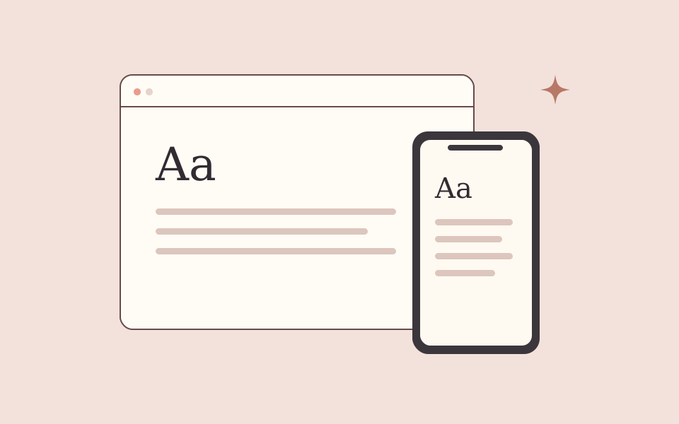
A page can fit inside a phone screen and still be difficult to use. Readability depends on the relationship between type, spacing, navigation, images, and the interruptions around them. Start by reading a complete article on a narrow screen rather than inspecting the homepage alone.
Give the words enough space
Use text that remains comfortable at the default zoom level. Avoid extremely long lines on desktop and cramped margins on a phone. Paragraph breaks should help the reader follow an idea without turning every sentence into a separate block.
Keep headings descriptive. Someone scanning the page should be able to find the section that answers their question. Use an actual heading hierarchy rather than choosing a heading only because of its visual size.
Make controls easy to distinguish
Do not rely on hover to reveal essential actions. A reader using a touchscreen or keyboard needs another way to discover and use them.
- Give links and buttons visible focus states.
- Leave room around adjacent touch targets.
- Keep navigation visually separate from article text.
- Label icon-only controls for assistive technology.
- Keep advertisements distinct from links, downloads, and navigation.
Prevent avoidable movement
Reserve the appropriate space for images and other content that loads later. A reader should not lose the sentence they are following because a large element appeared above it.
On article pages, place optional material where it does not repeatedly interrupt the main explanation. More boxes and widgets do not automatically create a more useful page.
Test the reading journey
Open the page directly, navigate by keyboard, follow a section link, and return using the browser's back button. Try a longer title, larger text, and an article containing a code block or table.
The test is not whether the page resembles its desktop version. It is whether the person can understand the content and complete the next useful action without fighting the layout.